

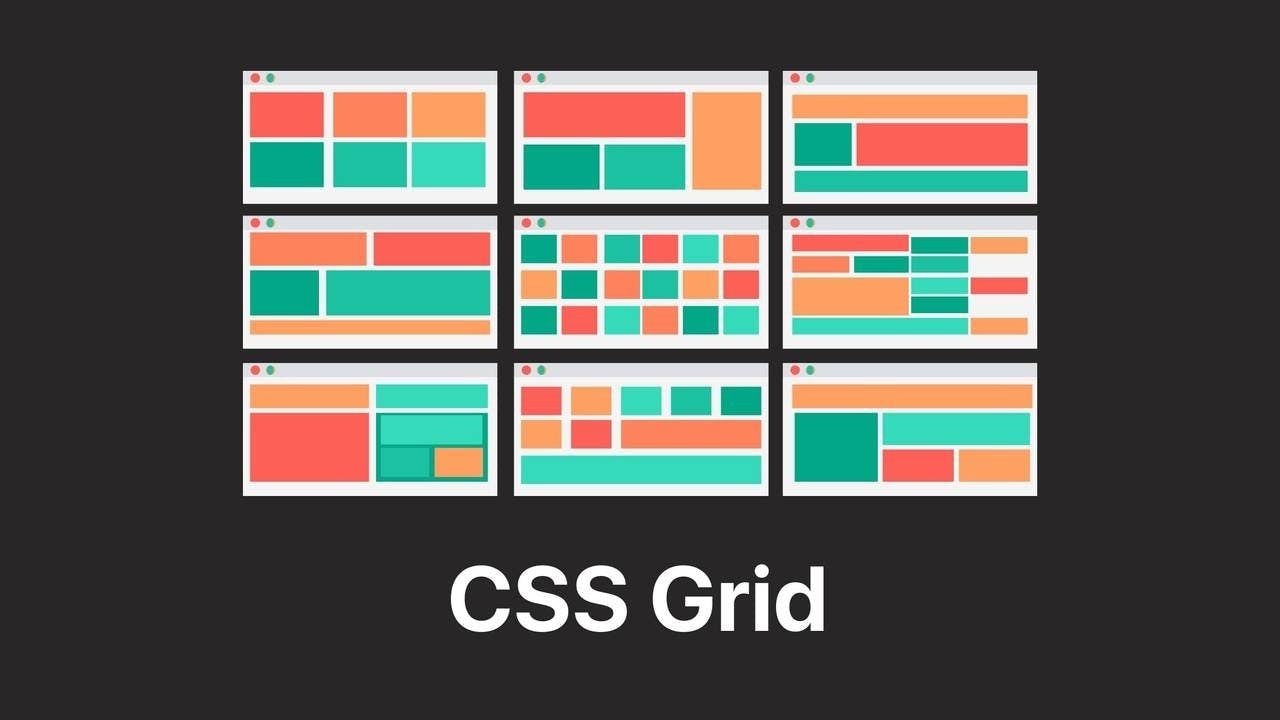
CSS Grid - Bootcamp Student POV


Third week in a coding bootcamp, we were introduced to CSS Grid. I have my experiences in programming but no CSS Grid. This topic is pretty new to me together with CSS Flexibox. Here is my point of view regarding CSS Grid...
CSS grid is a powerful layout system because we can work with rows and columns at the same time which means that it opens a lot of different possibilities to build more complex and organized design systems. To simply compare with Flexibox, Flexibox only lets you choose one (either row or column) to layout your project or content.
Ways to implement
Grid-template-areas
For me the friendly way to understand and implement CSS Grid is using grid-template-areas. Grid-template-areas lets you visualize the layout in your codes. Here's an example...

container{
display: grid;
grid-template-columns: 1fr, 1fr, 1fr;
grid-template-areas:
    "red red orange",
    "dgreen lgreen orange";
gap: 15px; /* creates division / gutters between grid items */
}
.red-section{
    grid-area: red;
}
.orange-section{
    grid-area: orange;
}
.dgreen-section{
    grid-area: dgreen;
}
.lgreen-section{
    grid-area: lgreen;
}
The code might look weird but it helps a lot to visualize and easily assign the position of the sections. The only requirement is that you need to assign a name for the class sections to be used in grid-template-areas using grid-area. I recommend experiencing this first to understand how CSS Grid works.
Grid-column & Grid-row
Using Grid-column and Grid-row is a bit confusing for me because you need to visualize the layout or you need an actual visual aid like drawing to help you assign the positions of the sections. In grid-template-area, we are looking at the grid area of the sections but this time we are focused in grid lines.

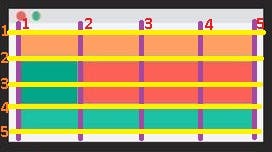
First, you need to decide how are you going to divide the main container to accommodate all the sections in your desired layout. I equally divided the every column and row so I can assign 1fr (1fraction) for each.
container{
display: grid;
grid-template-columns: 1fr, 1fr, 1fr, 1fr;  /* 4 fr for 4 columns */
grid-template-rows:  1fr, 1fr, 1fr, 1fr;  /* 4 fr for 4 rows */
}
.orange-section{
/* this will occupy the grid area between horizontal grid lines from 1 to 2 */
    grid-row: 1 / 2;
/* this will occupy the grid area between vertical grid lines from 1 to 5 */
    grid-column: 1 / 5;
}
.dgreen-section{
    grid-row: 2 / 4;
    grid-column: 1 / 2;
}
.red-section{
    grid-row: 2 / 4;
    grid-column: 2 / 5;
}
.lgreen-section{
    grid-row: 4 / 5;
    grid-column: 1 / 5;
}
Most of the time, the assigned values in grid-template-rows and grid-template-columns makes this implementation difficult to deal with. There is a lot of adjusting and resizing of the contents. Although, I casually ignore the declaration of grid-template-rows because I noticed that it will automatically add rows and the sizes of the rows will adjust instantly depending on its contents. I do not recommend ignoring grid-template-row declaration but in my case, it makes me code easily.
Using nth-child()
In this implementation we are going to use grid-row and grid-column and :nth-child() to select specific sections to be positioned.

Let us assume that every section is arranged in order in the HTML file. I am not going to use grid-template-rows in the main container to let it automatically create rows if needed.
container{
display: grid;
grid-template-columns: repeat(4, 1fr);  /* 4 fr for 4 columns */
}
div:nth-child(1){
    grid-column: 1 / 3;
}
I select the first child and put a value in grid-column to occupy two grid areas horizontally. Then the system will assign it in the first row automatically.
I will let the second (2nd) to sixth (6th) child to position themselves to occupy 1fr each. Then, I will call the seventh (7th) child to occupy the third row and to leave the last column of the second row empty.
div:nth-child(7){
    grid-row: 3 / 5;
    grid-column: 1 / 3;
}
Lastly, I will call the 11th child to leave the last column of the fourth row empty and start occupying the fifth row.
div:nth-child(11){
    grid-row: 5 / 6;
    grid-column: 1 / 4;
}
This is the most convenient implementation that I discovered online and what I am currently using. I do not need to call all child section one by one to assign their positions as they automatically occupy the available grid areas respectively.
Takeaways
Disclaimer: I am still discovering things. I might get the concepts of the properties wrong but you can always try and discover.
I strongly recommend trying the grid-template-areas first to understand the positioning of the sections. This practice helped me comprehend the concept of CSS Grid.
Use dot (.) in grid-template-areas to declare or assign empty grid area.
Always use gap to create division / gutters between the grid items. This is very useful in creating spaces in between and aid to clearly visualize your layout.
Prepare a visual aid especially when you are using grid-row and grid-column in positioning sections to assign values faster.
Values in grid-row and grid-column depend on grid lines.
Use :nth-child() to select specific child section with different grid layout and let the other child sections auto assign themselves. Try searching ways to select the child items as this may help you call two or more child items in one call.
Leaving the grid-template-rows empty is pretty convenient when I am working with CSS grid layout. I do not need to worry in the sizes (height) of the sections because the row will adjust instantly depending to its content but you also need to consider the other sections on the same row.
In Grid-column & Grid-row implementation, in the given image sample you can declare grid-template-rows: 1fr 2fr 1fr; since the grid items in the second row all have twice size as the other rows. They will not conflict to the grid areas of the other rows. This create three rows, instead of four rows.
Dividing the row and column equally will help you decide what values to assign in every row and column.
When to use GRID
According to Leonardo Maldonado
Complex design implementation: The two-dimensional layout system is perfect to create a complex design.
You need to have a gap between block elements: We can define the gap between our rows or columns very easily, without having to use the margin property, which can cause some side effects especially if we’re working with many breakpoints
You need to overlap elements: Overlapping elements using CSS Grid is very easy, you just need to use the grid-column and grid-row properties.
You need a layout-first design: When you already have your layout design structure, it’s easier to build with CSS Grid, and the two-dimensional layout system helps us a lot when we’re able to use rows and columns together.
This content is purely based on my one week experience using CSS Grid layout. I might not explained some things clearly or I might have used the properties wrong. But I am happy to share my understanding. Any discoveries and knowledge that I may cross upon while practicing CSS grid layout will be added soon. I appreciate any help and correction regarding my content.